How is Our World Doing?
Many people would respond to this question with an answer somewhere in the range between “not great” and “terrible”.
But if you look at the long term trends, we’re actually doing very well.
Why do I think this? Here’s some fact-based evidence …
Extreme Poverty is Plummeting
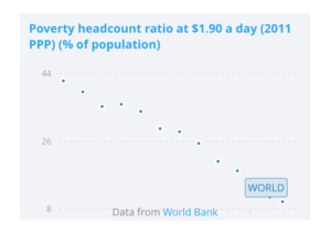
- Source: https://www.worldbank.org/en/topic/poverty/overview
- “According to the most recent estimates, in 2015, 10 percent of the world’s population lived on less than US$1.90 a day … down from nearly 36 percent in 1990.”
- You may wonder: Are these figures inflation-adjusted? Or has part of this decrease occurred because the definition of extreme poverty has, due to inflation, become more and more extreme?
- It looks as though this isn’t the case: https://www.odi.org/blogs/9934-definition-extreme-poverty-has-just-changed-here-s-what-you-need-know
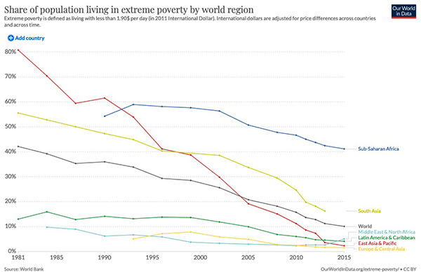
- Source: https://ourworldindata.org/grapher/share-of-population-living-in-extreme-poverty-by-world-region
- Note the explanation at the top: “International dollars are adjusted for price differences across countries and across time.”
Percent of Population Living in Extreme Poverty – 1981-2015
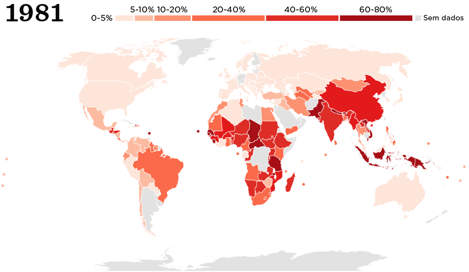
- Source: https://www.nexojornal.com.br/grafico/2019/02/20/A-população-abaixo-da-linha-de-pobreza-extrema-no-mundo
- Web page says “Fonte: Banco Mundial”, i.e. “Source: World Bank”
Gapminder Data – Life Expectancy, Child Mortality & Literacy
- The Gapminder Foundation’s mission: https://www.gapminder.org/about-gapminder/our-mission/
- Gapminder Tools: https://www.gapminder.org/tools/
- I suggest that you start by running the animation that initially displays, which shows income (X Axis) and life expectancy (Y axis) as they change between 1800 and the present. Then experiment with the popup menu located at the bottom of the chart. This allows you to change the data displayed on the X axis to measures like Child Mortality, Literacy, CO2 emissions, and much, much more. No, it isn’t all good news, but there’s a lot of good news here.
- How accurate is this data? See the “data doubts” link at bottom right.
Obviously, there’s still much that we need to do …
Of course! Just for starters, having one in ten people living in extreme poverty is still a huge problem. And then there’s climate change. And so much more …
It’s important that we be aware of these problems and work at solving them.
But if we only focus on the problems, and don’t see them within the context of our truly wonderful human progress, this doesn’t help. Instead, it discourages us and makes it harder for us to solve our problems.
Seeing the big picture has two advantages. It’s more accurate, and it promotes hope.